

BMC Twelfthly: August ’24
BMC Twelfthly: August ’24
Grids and the tyranny of the intentional.

Hey y'all. Here's a weird thing I do when I design.
I use increments of 9 points to make alignments. Say I have a graphic that is 61 points from the top edge of my poster. I'll often bump it down to 63. Or say a headline is sized at 34 points. I'll bump that up to 36. I'm constantly checking the x and y axis fields in my transform panel and repositioning things in increments of 9.
Can anyone except me tell the difference? Probably not. Is it a little obsessive? Yep. But here's why I do it: when you step back and put all of these little adjustments together, you get an overall feeling of precision and "correctness."
I've come to realize that this technique is my weird, intuitive, ad hoc version of a grid. For the non-graphic designers in the house, a grid is a layout tool. It's sorta exactly what it sounds like: a system of evenly spaced vertical and horizontal guides. Grids help you make decisions about where to place things. You use them to align visual elements and create order and clarity.
Grids were a big part of my college education (I remember checking this Josef Müller-Brockmann book out from the library). They were part of a larger emphasis on intentionality. Professors would often tell us that there should be a reason for any design decision, no matter how small. "Why is this type set in sans-serif?" "What were you trying to convey with the color red?" And so on. The grid was a way of answering, "why is this here and not there?"
I'm grateful to my professors for instilling this ethos in me — I can trace my 9pt alignment system (and any polish that it gives my work) back to them. But here's the thing. I am also thrilled when I encounter designs like this or this because they have a spontaneity and ease about them. There's a word in Italian — sprezzatura — which means "studied carelessness." Or in music, there's this idea of swing or groove (ideas that stand in opposition to quantization. Interesting that a grid exists in the musical world too.)
I think there are parts of life — parts of creating, of songwriting, etc. — where weirdly we can be too considerate. Our insistence on purposefulness pushes verve and surprise out of the house. So sometimes I find myself trying to buck my design upbringing. I try to be okay with not knowing why I decided to do this or that. I try to leave the front door open so intuition can visit.
Here's a theory I want to run by you: great art has an interesting or atypical ratio of training to wildness. Training softens the unwieldy or edgelord-y impulses of wildness. Wildness challenges the stasis and bloodlessness of training. This song is absolutely unhinged, but there is still precision and a weird shadowy rationale undergirding the whole thing. This song follows a very well-ordered pop formula, but also has hilariously unexpected scream-y interludes.
This ratio is something I try to keep in mind while making, especially if things aren't quite hitting. I'm sure you can think of other examples and you should definitely share them in the comments! Anyhow. Hope you're finding dynamic balances in your art and life. Thanks for reading and see ya next month.
Recent Work
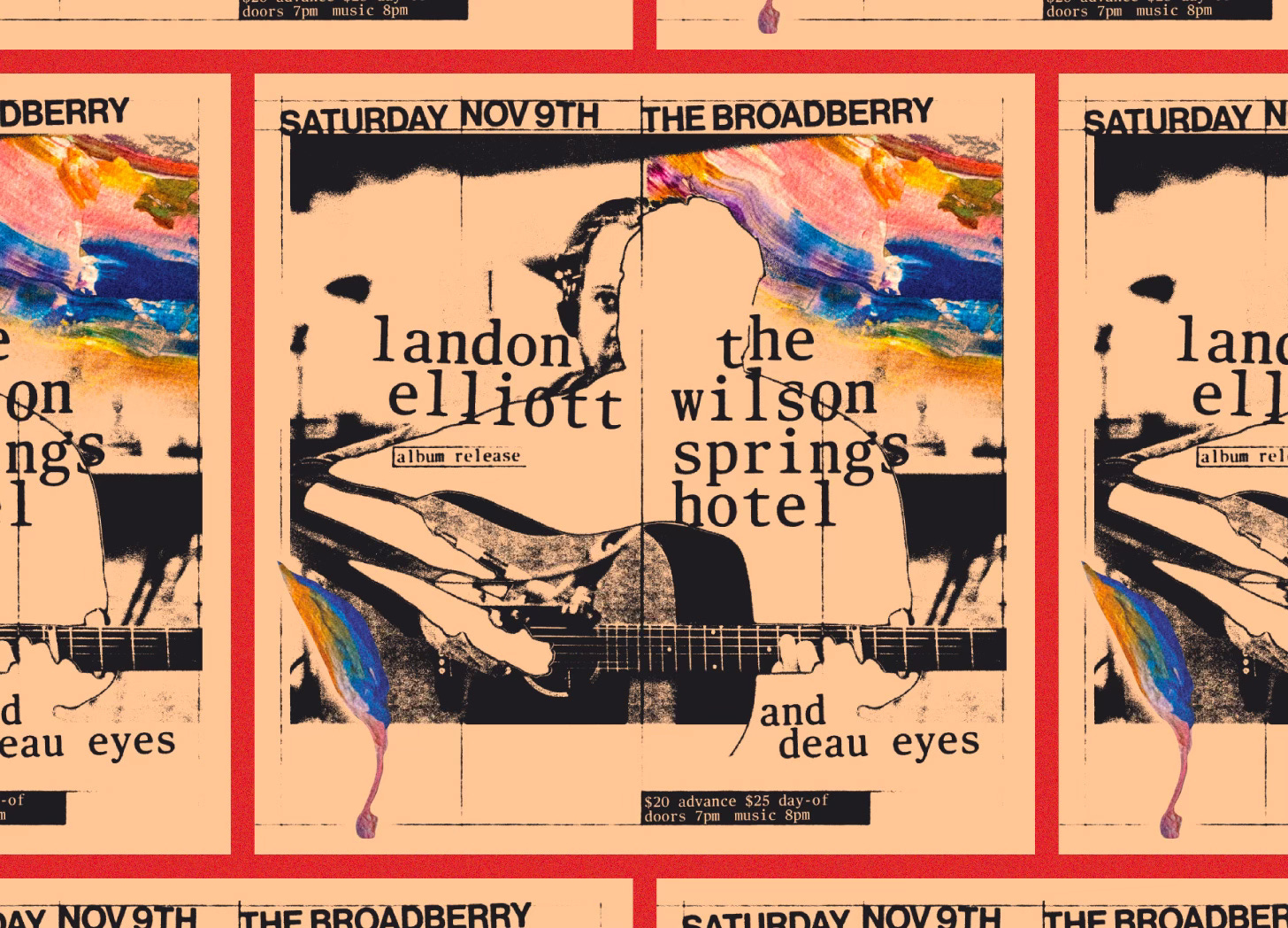
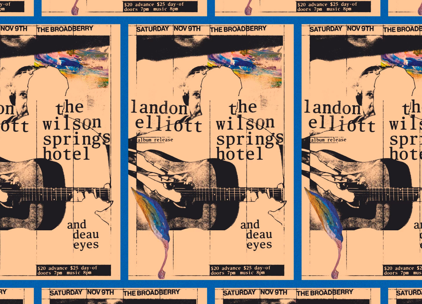
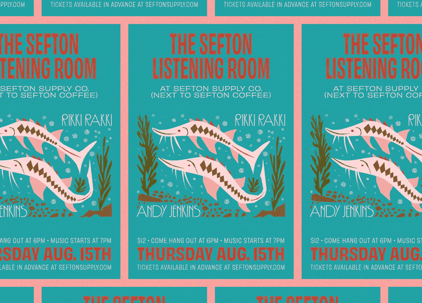
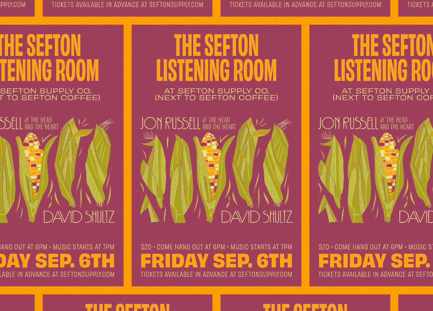
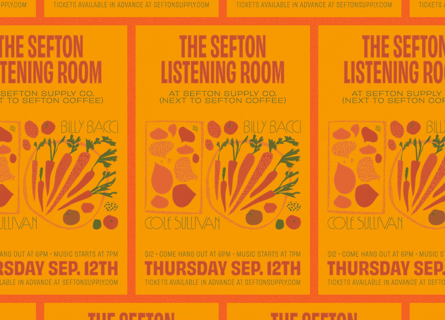
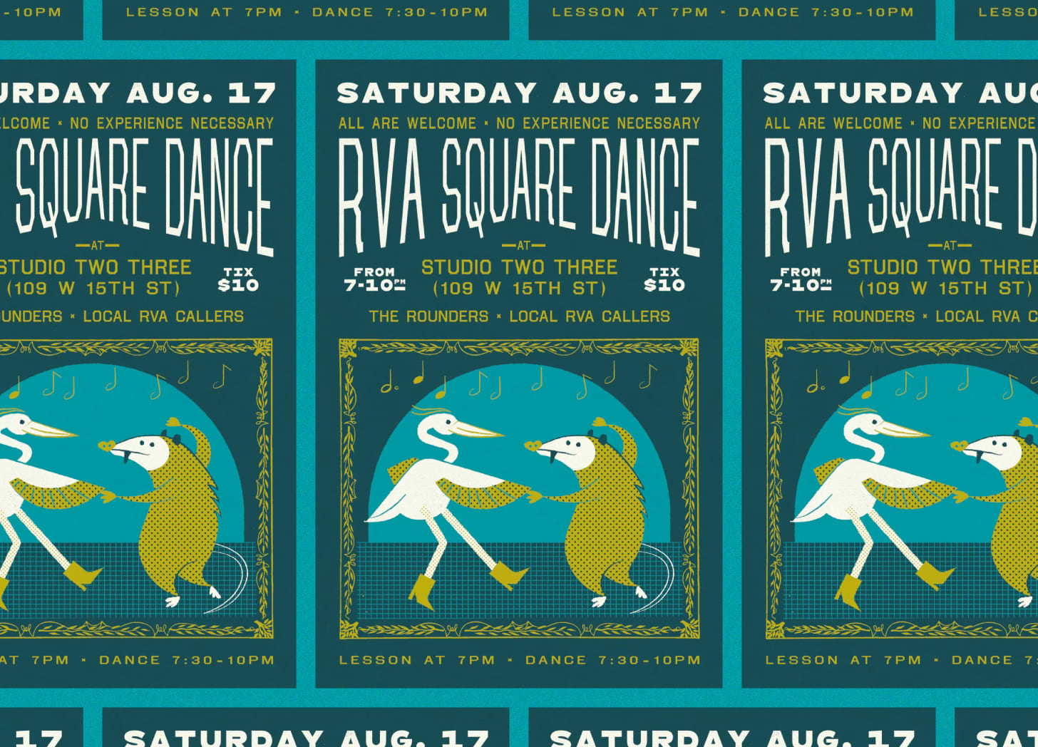
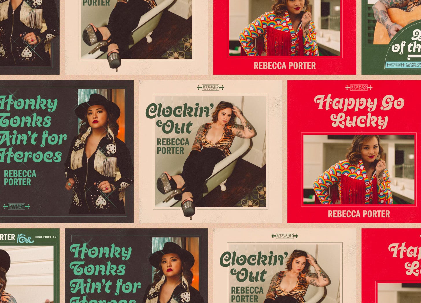
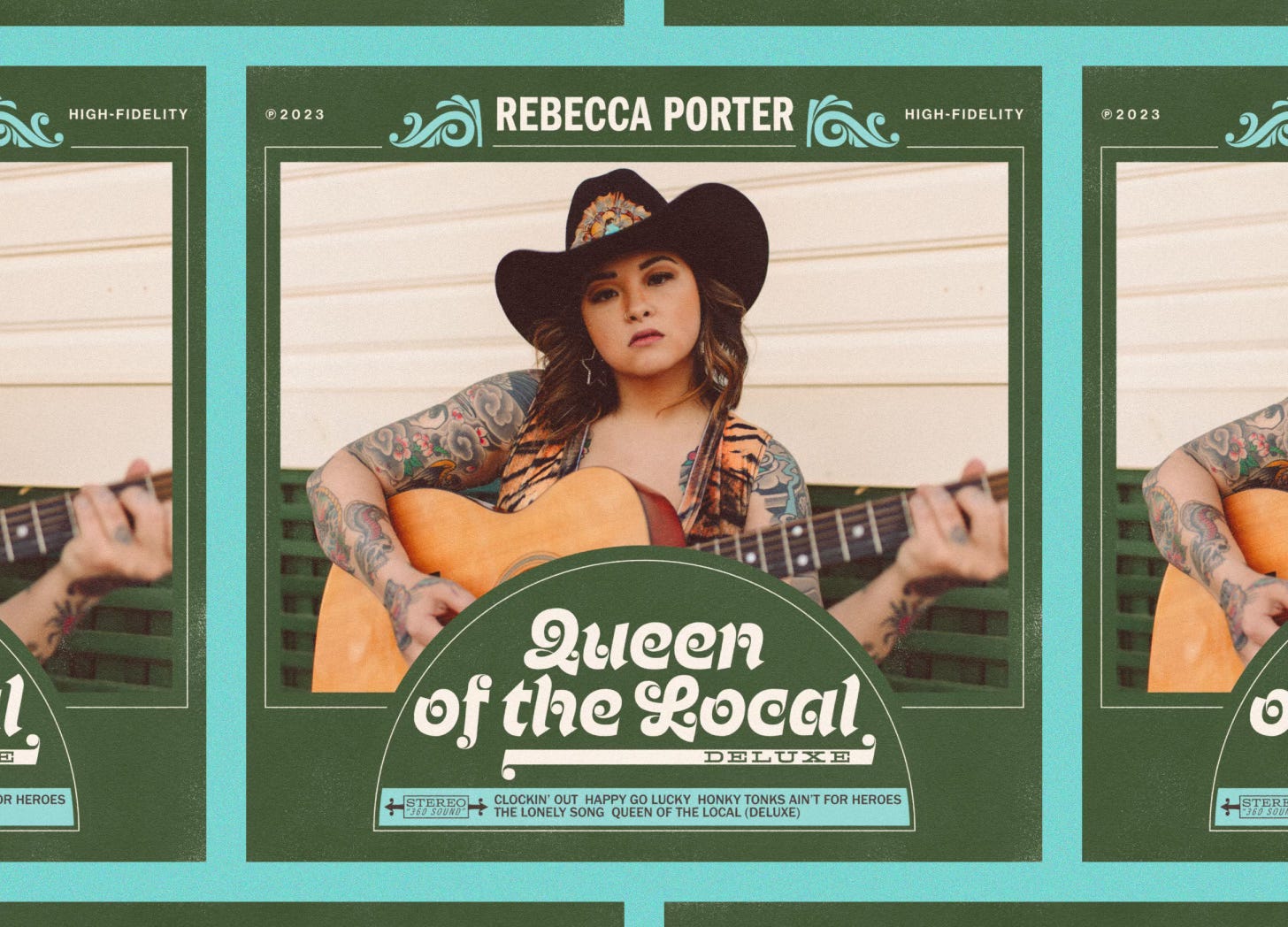
Some of what’s flown the coop. You can always see more over at the ol’ portfolio: brentmccormick.com
Whiskers on kittens
A few of my favorite things.
Recently listened to an audiobook version of The Death of Ivan Ilyich (after hearing about it via this great conversation). At times very funny, but on the whole a very cold and invigorating splash of water.
I think about this advice from Kurt Vonnegut often. I love how deliciously subversive it is. Art doesn’t have to be shared. It can be a way of connecting to others, sure, but it can also be a way of connecting with yourself.
In case you’re like me and take forever to get to things: The Wonderful Story of Henry Sugar (and the other two shorts released alongside it) was great. Underneath all of Wes Anderson’s delightful formalism (talk about a grid user!) is deep heartfelt emotion.